Single-Stock Circuit Breakers Math, CS, Data
NOTE: The analysis described in this article is out of date. Since writing it, I have changed my mind about a few decisions and realized a few oversights. A much better analysis is available for download as a pdf. Let me warn you that it's about forty pages long.
On May 6, 2010, the U.S. stock market experienced what has come to be called the “flash crash,” in which the prices of various stocks fluctuated violently. Overall, the market rapidly plunged about nine percent and recovered minutes later. In respone, the SEC and stock exchanges devised the Single-Stock Circuit Breaker (SSCB) rules, which were implemented gradually. According to Traders Magazine,
The single-stock circuit breakers will pause trading in any component stock of the Russell 1000 or S&P 500 Index in the event that the price of that stock has moved 10 percent or more in the preceding five minutes. The pause generally will last five minutes, and is intended to give the markets a hiatus to attract trading interest at the last price, as well as to give traders time to think rationally.
It is important to note that the rules do not apply to the first fifteen minutes or the last fifteen minutes of each trading day.
Under the direction of Dr. Michael Kane, I am analyzing recent stock data. The aim of our research is to understand the effects of the SSCB rules. In particular, do the rules have any effect on the daily volatility profiles of stocks?
My data analysis uses the following files: 2010.csv, 2011.csv, cap.csv, activity.csv, and RussellOrSP.txt.
Data Analysis
In my previous post, I describe how I processed the TAQ data and acquired market cap data. Now, for each stock I have a series of volatility estimates throughout the trading day over two distinct time periods: one period from 2010 before the SSCB policy and another period from 2011 after the SSCB rules were enacted.
The SSCB rules only apply to a subset of stocks: any stock in the Russell 1000 Index or the S&P 500. Unfortunately for our analysis, these stocks are systematically different from the average. They tend to be stocks of very large companies. This is obviously not ideal, but I will do my best to control for the systematic differences.
At this point, we have squared volatility profile estimates for 1690 stocks. 694 of these are in the SSCB group, while the remaining 996 comprise the non-SSCB group.
I started by working with the data from 2010. During this period, the SSCB rules were not in place yet. This step establishes a baseline. Did the two groups of stocks have similar volatility profiles before the rules were enacted?
Here is a typical example of a stock’s estimated squared volatility profile.
vols <- read.csv("2010.csv", row.names = 1)
t <- 2.5 + 5 * (0:77)

set.seed(2)
i <- runif(1, 1, nrow(vols))
plot(t, vols[i, ], main = rownames(vols)[i], xlab = "Minutes into Day",
     ylab = "Squared Volatility")
Spread Versus Level
It is clear from browsing more of these plots that the first and last points of the day tend to be the highest. They also seem to have the most variability. In fact, the following plot confirms that a strong relationship exists between spread and level. Times of the day with higher volatilities also have higher variation in their volatilities.
means <- apply(vols, 2, mean)
sds <- apply(vols, 2, sd)
plot(means, sds, xlab = "Level", ylab = "Spread", main = "Original Data")
Generally, analyses go more smoothly if this relationship can be transformed away. A log transform does the trick.
vols <- log(vols)
means <- apply(vols, 2, mean)
sds <- apply(vols, 2, sd)
plot(means, sds, xlab = "Level", ylab = "Spread", main = "Log Transformed Data")
Smoothing the Profiles
Clearly, we expect neighboring data points of a volatility profile to be very close to each other. In such cases as this, one can often improve the quality of one’s data by letting neighboring points “inform” each other. With a little thought and exploration, I found that a parametric fit worked nicely to smooth the volatility profiles. The 78 data points are well summarized by a fifth degree polynomial.
# Initialize
stocks <- rownames(vols)
n <- nrow(vols)
m <- ncol(vols)
t.mat <- cbind(t, t^2, t^3, t^4, t^5)

# Demonstrate fit on random stock
set.seed(2)
i <- runif(1, 1, n)
v <- unlist(vols[i, ])
L <- lm(v ~ t.mat)

# Plot original points with fittted curve
plot(t, v, main = stocks[i], xlab = "Minutes into Day",
     ylab = "Log of Squared Volatility")
lines(t, L$fit, col = 2)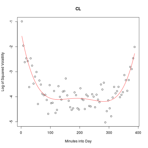
The residuals show no remaining structure in the data.
plot(t, L$res, main = stocks[i], xlab = "Minutes into Day",
     ylab = "Residuals of Log of Squared Volatlity")
abline(h = 0, col = 2, lty = 2)
I apply this smoothing procedure to each stock.
smooth <- matrix(NA, n, m, dimnames = list(stocks, t))
for (i in 1:n) {
    v <- unlist(vols[i, ])
    L <- lm(v ~ t.mat)
    smooth[i, ] <- L$fit
}
Notice that the averages of the residuals do not show any discernable pattern either.
res <- vols - smooth
dimnames(res) <- list(stocks, t)
plot(t, apply(res, 2, mean), main = "Average of Residuals", ylab = "Mean",
     xlab = "Minutes into Day")
abline(h = 0, col = 2, lty = 2)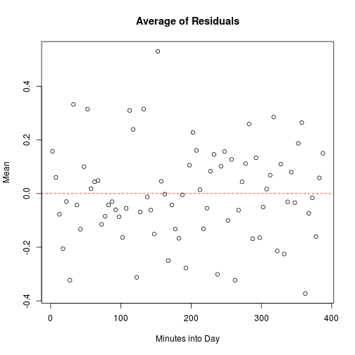
Controlling for Other Factors
Ultimately, we want to know whether differences in volatility profiles are related to a stock’s SSCB group status. But the SSCB group is systematically different from the other in a few ways. Two differences that I think are important are market cap (MC) and trading frequency (TF). Before comparing the groups, I will try to control for these factors.
Market Cap
First, let us see if market cap has any effect on volatility profiles by making some plots. There is a clear relationship between market cap and any given column of the volatility profile matrix.
cap <- read.csv("cap.csv", row.names = 1)
cap.log <- log(cap[, 1])  # for 2010
set.seed(1)
i <- runif(1, 1, m)
v <- smooth[, i]

plot(cap.log, v, main = "2010", xlab = "Log of Market Cap",
     ylab = paste("Smoothed Log of Squared Volatilities @ t =", t[i]))
# Because we found a relationship, we should control for it
cap.mat <- cbind(cap.log, cap.log^2)
L <- lm(v ~ cap.mat)
grid <- seq(19, 26, by = 0.1)
lines(grid, cbind(1, grid, grid^2) %*% L$coef, col = 2)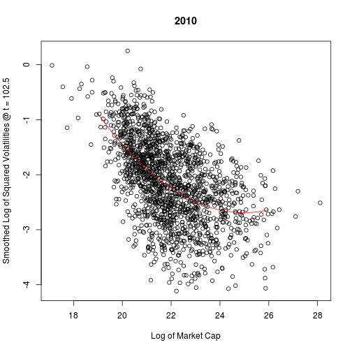
summary(L)


##
## Call:
## lm(formula = v ~ cap.mat)
##
## Residuals:
##     Min      1Q  Median      3Q     Max
## -1.9557 -0.3881  0.0222  0.4344  1.8034
##
## Coefficients:
##                Estimate Std. Error t value Pr(>|t|)
## (Intercept)    28.68558    2.45335    11.7   <2e-16 ***
## cap.matcap.log -2.51283    0.22010   -11.4   <2e-16 ***
## cap.mat         0.05031    0.00492    10.2   <2e-16 ***
## ---
## Signif. codes:  0 '***' 0.001 '**' 0.01 '*' 0.05 '.' 0.1 ' ' 1
##
## Residual standard error: 0.612 on 1687 degrees of freedom
## Multiple R-squared: 0.319,	Adjusted R-squared: 0.319
## F-statistic:  396 on 2 and 1687 DF,  p-value: <2e-16
Plotting the residuals, we see that no clear pattern remains. Therefore, I am satisfied that we have controlled for market cap.
plot(cap.log, L$res, main = "2010", xlab = "Log of Market Cap",
     ylab = paste("Residuals @ t =", t[i]))
In fact, the plots look basically the same for each column: there is always a curved negative relationship. A quadratic fit works well in every case. Therefore, I will use a quadratic fit to control each column for market cap.
for (i in 1:m) {
    L <- lm(smooth[, i] ~ cap.mat)
    smooth[, i] <- L$res + mean(smooth[, i])
}
Trading Frequency
Next, we will consider the effect of trading frequency on the columns. We must first remove the relationship between trading frequency and market cap.
act <- read.csv("activity.csv", row.names = 1)
act.logmean <- log(apply(act[, 1:18], 1, mean))
plot(cap.log, act.logmean, xlab = "Log of Market Cap",
     ylab = "Log of Avg of Number of Seconds in which Trades Occurred")
L <- lm(act.logmean ~ cap.mat)
lines(grid, cbind(1, grid, grid^2) %*% L$coef, col = 2)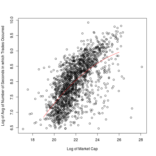
summary(L)


##
## Call:
## lm(formula = act.logmean ~ cap.mat)
##
## Residuals:
##     Min      1Q  Median      3Q     Max
## -2.2393 -0.3559  0.0556  0.3847  1.7676
##
## Coefficients:
##                Estimate Std. Error t value Pr(>|t|)
## (Intercept)    -11.1332     2.1404   -5.20  2.2e-07 ***
## cap.matcap.log   1.4155     0.1920    7.37  2.6e-13 ***
## cap.mat         -0.0247     0.0043   -5.76  1.0e-08 ***
## ---
## Signif. codes:  0 '***' 0.001 '**' 0.01 '*' 0.05 '.' 0.1 ' ' 1
##
## Residual standard error: 0.534 on 1687 degrees of freedom
## Multiple R-squared: 0.429,	Adjusted R-squared: 0.429
## F-statistic:  635 on 2 and 1687 DF,  p-value: <2e-16
The quadtratic fit seems good enough, so I will use it to control.
plot(cap.log, L$res, main = "2010", xlab = "Log of Market Cap",
     ylab = "Residuals of Log of Avg Number of Seconds in which Trades Occurred")
act.logmean <- L$res + mean(act.logmean)Now, I can look for a relationship between the columns and the trading frequency. Let’s look at a random column.
set.seed(2)
i <- runif(1, 1, m)
v <- smooth[, i]

plot(act.logmean, v, main = "2010",
     xlab = "Log of Avg Number of Seconds in which Trades Occurred (MC Removed)",
     ylab = paste("Smoothed Log of Squared Volatilities @ t =", t[i], "(MC Removed)"))
act.mat <- cbind(act.logmean, act.logmean^2)
L <- lm(v ~ act.mat)
grid <- seq(6.5, 9, by = 0.1)
lines(grid, cbind(1, grid, grid^2) %*% L$coef, col = 2)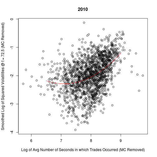
summary(L)


##
## Call:
## lm(formula = v ~ act.mat)
##
## Residuals:
##     Min      1Q  Median      3Q     Max
## -2.1245 -0.3270  0.0433  0.3702  2.0216
##
## Coefficients:
##                    Estimate Std. Error t value Pr(>|t|)
## (Intercept)          12.667      1.913    6.62  4.7e-11 ***
## act.matact.logmean   -4.213      0.488   -8.64  < 2e-16 ***
## act.mat               0.297      0.031    9.56  < 2e-16 ***
## ---
## Signif. codes:  0 '***' 0.001 '**' 0.01 '*' 0.05 '.' 0.1 ' ' 1
##
## Residual standard error: 0.544 on 1687 degrees of freedom
## Multiple R-squared: 0.197,	Adjusted R-squared: 0.196
## F-statistic:  207 on 2 and 1687 DF,  p-value: <2e-16
A quadratic fit works well.
plot(act.logmean, L$res, main = "2010", xlab = "Log of Market Cap",
     ylab = paste("Residuals @ t =", t[i]))
Again, all of the columns give very similar plots.
for (i in 1:m) {
    L <- lm(smooth[, i] ~ act.mat)
    smooth[, i] <- L$res + mean(smooth[, i])
}
Now, we need to repeat the smoothing and controlling process for the 2011 volatility data. The same steps work well in the 2011 case, too. I wrote a function to go through these steps for each year without making any plots.
control <- function(y, x) {
    L <- lm(y ~ x)
    return(L$res + mean(y))
}

VolProfile <- function(vfile, cap, act) {
    vols <- log(read.csv(vfile, row.names = 1))
    stocks <- rownames(vols)
    n <- nrow(vols)
    m <- ncol(vols)

    # Smooth profiles
    t <- 2.5 + 5 * (0:77)
    t.mat <- cbind(t, t^2, t^3, t^4, t^5)
    smooth <- matrix(NA, n, m, dimnames = list(stocks, t))
    for (i in 1:n) {
        L <- lm(unlist(vols[i, ]) ~ t.mat)
        smooth[i, ] <- L$fit
    }

    # Control Columns for Market Cap
    cap.log <- log(cap)
    cap.mat <- cbind(cap.log, cap.log^2)
    for (i in 1:m) {
        smooth[, i] <- control(smooth[, i], cap.mat)
    }

    # Control Trading Frequency for Market Cap
    act.logmean <- log(apply(act, 1, mean))
    act.logmean <- control(act.logmean, cap.mat)

    # Control Columns for Trading Frequency
    act.mat <- cbind(act.logmean, act.logmean^2)
    for (i in 1:m) {
        smooth[, i] <- control(smooth[, i], act.mat)
    }

    return(smooth)
}


cap <- read.csv("cap.csv", row.names = 1, check.names = F)
act <- read.csv("activity.csv", row.names = 1)

s2010 <- VolProfile("2010.csv", cap[, 1], act[, 1:18])
s2011 <- VolProfile("2011.csv", cap[, 2], act[, 19:68])
Principal Component Analysis
It is still not obvious how we should compare the volatility profiles to each other. Each profile consists of 78 highly correlated values, and they all have a very similar shape to their curves. In other words, 78 values seems like overkill. Is there some simpler representation of each profile that still captures the variation among them? To me, this seems like a perfect chance to make use of principal component analysis (PCA).
You may note that the data smoothing actually reduced the volatilities profiles to six dimensions. Perhaps I should perform the PCA on those parameter values. My rationale for using the 78 estimated volatility values is that they are all on a comparable scale with each other.
Combined Data
First, I will run PCA on all of the data from both years together.
combined <- rbind(s2010, s2011)
p <- princomp(combined)
vars <- p$sdev^2
varprops <- vars/sum(vars)
signif(varprops[1:8], 3)


##   Comp.1   Comp.2   Comp.3   Comp.4   Comp.5   Comp.6   Comp.7   Comp.8
## 9.33e-01 2.31e-02 1.66e-02 1.29e-02 7.54e-03 6.62e-03 1.80e-16 6.61e-17


plot(1:8, varprops[1:8], type = "s", main = "Combined Data",
     xlab = "Number of Principal Components",
     ylab = "Proportion of Variability Gained")
abline(h = 0, lty = 2, col = 3)
Indeed, over ninety three percent of the variability is concentrated in the first principal component. I will maintain the second principal component as well, largely because it allows for richer plots. These two principal components are a proxy for the volatility profiles.
Let us try to interpret these principal components by visualizing the first and second loadings. It seems that the first principal component is basically measuring the overall level of the volatility curves, emphasizing the middle of the day.
load1 <- p$loading[, 1]
t <- 2.5 + 5 * (0:77)
plot(t, load1, main = "Combined Data", xlab = "Minutes into Day",
     ylab = "Weight in First Principal Component")
The second principal component acts as a measure of the difference between late and early volatility.
load2 <- p$loading[, 2]
plot(t, load2, main = "Combined Data", xlab = "Minutes into Day",
     ylab = "Weight in Second Principal Component")
Below is a plot of the “landscape” of these two components, colored by group and year. Blue corresponds to non-SSCB, and red corresponds to SSCB. The lighter colored points are from 2010, while the darker ones are from 2011. The four means are also plotted in the appropriate colors.
pc1 <- p$scores[, 1] + sum(p$center * load1)
pc2 <- p$scores[, 2] + sum(p$center * load2)

SSCBstocks <- readLines("RussellOrSP.txt")
stocks <- rownames(combined)
sscb <- stocks %in% SSCBstocks
group <- rep(sscb, 2)
year <- rep(c(1, 2), each = length(stocks))
cols <- sapply(year + 2 * group, function(x)
               switch(x, "cyan3", "blue", "pink2", "red"))
plot(pc1, pc2, pch = ".", col = cols, cex = 1.2, main = "Combined Data",
     xlab = "First Principal Component", ylab = "Second Principal Component")

# Plot means
pc1.2010 <- pc1[1:length(stocks), ]
pc2.2010 <- pc2[1:length(stocks), ]
pc1.2011 <- pc1[-(1:length(stocks)), ]
pc2.2011 <- pc2[-(1:length(stocks)), ]

m1n0 <- mean(pc1.2010[!sscb])
m2n0 <- mean(pc2.2010[!sscb])
m1n1 <- mean(pc1.2011[!sscb])
m2n1 <- mean(pc2.2011[!sscb])
m1s0 <- mean(pc1.2010[sscb])
m2s0 <- mean(pc2.2010[sscb])
m1s1 <- mean(pc1.2011[sscb])
m2s1 <- mean(pc2.2011[sscb])

text(m1n0, m2n0, "N0", col = "cyan3")
text(m1n1, m2n1, "N1", col = "blue")
text(m1s0, m2s0, "S0", col = "pink2")
text(m1s1, m2s1, "S1", col = "red")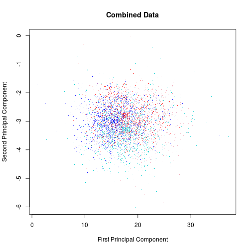
Let us zoom in and just look at concentration ellipses to get a general idea the shapes and locations of the four groups.
plot(c(14, 22), c(-3.5, -2.5), type = "n", main = "Combined Data", xlab = "First Principal Component",
    ylab = "Second Principal Component")

text(m1n0, m2n0, "N0", col = "cyan3")
text(m1n1, m2n1, "N1", col = "blue")
text(m1s0, m2s0, "S0", col = "pink2")
text(m1s1, m2s1, "S1", col = "red")

library(ellipse)

Cn0 <- cov(cbind(pc1.2010[!sscb], pc2.2010[!sscb]))
Cn1 <- cov(cbind(pc1.2011[!sscb], pc2.2011[!sscb]))
Cs0 <- cov(cbind(pc1.2010[sscb], pc2.2010[sscb]))
Cs1 <- cov(cbind(pc1.2011[sscb], pc2.2011[sscb]))

lines(ellipse(Cn0, centre = c(m1n0, m2n0), level = 0.05), col = "cyan3")
lines(ellipse(Cn1, centre = c(m1n1, m2n1), level = 0.05), col = "blue")
lines(ellipse(Cs0, centre = c(m1s0, m2s0), level = 0.05), col = "pink2")
lines(ellipse(Cs1, centre = c(m1s1, m2s1), level = 0.05), col = "red")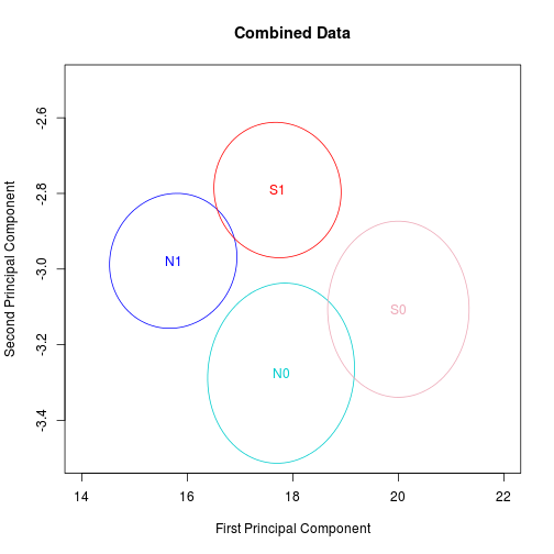
The SSCB and non-SSCB stocks were different from each other in both periods. Furthermore, the difference looks quite similar. Nothing in this picture suggests an effect from the SSCB rules. But we still cannot rule it out.
One other notable observation is that volatility profiles in general are shifting over time. That might be an interesting topic to explore further at some point.
Changes
One more look at the data is worth pursuing. Let’s repeat the PCA on the differences (2011 values minus 2010 values).
changes <- s2011 - s2010

p <- princomp(changes)
vars <- p$sdev^2
varprops <- vars/sum(vars)
signif(varprops[1:8], 3)


##   Comp.1   Comp.2   Comp.3   Comp.4   Comp.5   Comp.6   Comp.7   Comp.8
## 8.29e-01 5.31e-02 3.60e-02 3.30e-02 2.53e-02 2.32e-02 1.04e-16 3.97e-17
This time, the first two principal components together comprise nearly ninety percent of the variability.
load1 <- p$loading[, 1]
load2 <- p$loading[, 2]
pc1 <- t(load1 %*% (t(changes) - p$center)) + sum(p$center * load1)
pc2 <- t(load2 %*% (t(changes) - p$center)) + sum(p$center * load2)

cols <- 2 + 2 * sscb
plot(pc1, pc2, pch = ".", col = cols, cex = 1.2, main = "Changes",
     xlab = "First Principal Component", ylab = "Second Principal Component")

points(mean(pc1[!sscb]), mean(pc2[!sscb]), col = 2, pch = "N")
points(mean(pc1[sscb]), mean(pc2[sscb]), col = 4, pch = "S")
Again, the picture shows no evidence that the SSCB rules have changed the affected stocks’ volatility profiles in any important way. The two distributions look basically identical.
For each component, a t-test fails to detect a significant difference between groups at the .05 level.
t.test(pc1[sscb], pc1[!sscb])$p.val


## [1] 0.06916


t.test(pc2[sscb], pc2[!sscb])$p.val


## [1] 0.8499blog comments powered by Disqus