Smoothing Data Math, CS, Data
Why Would Anyone Smooth Data?
You’ve used an imperfect instrument to measure $Y$ at a range of $x$ values. You believe that your instrument produces independent errors $\epsilon_i$, each with mean zero and variance $\sigma^2$. In other words, your model is
for some unknown function $g$.
Here is your data:
g <- function(x) {
    # This is just something I made up to demonstrate the point
    return(10 - x/9 + exp(-(x - 8)^2/6) + sin(x)/x + exp((x - 15)/8))
}

x <- seq(1, 20, by = 0.5)

truth <- sapply(x, g)
set.seed(1)
errors <- rnorm(length(x), sd = 0.2)
Y <- truth + errors

plot(x, Y, main = "Your Instrument Produced this Data")
points(x[31], Y[31], col = 2, lwd = 3)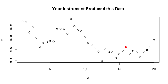
Now I want you to estimate $g(16)$ from your data. One obvious estimator is $Y_{31}$ (the red point on the plot) because it is the output of your instrument when $x$ was set to $16$. It is unbiased because the errors have mean zero. Its variance is $.04$, so that is the expected squared error of this estimate. If we had several observations at $x=16$, then we would probably average them to get a better estimate. In this case, we don’t have any more observations at $x=16$, but we do have some nearby observations. Could we let those neighboring $Y$ values inform our estimate of $g(16)$?
Answering this question requires thinking about the mechanism that is generating the data. Is the true relationship between $x$ and $Y$ likely to be “jumpy” or “smooth”? Most real-world phenomena behave smoothly, although there are some exceptions. You can look at your data and see if it seems like it might consist of random deviations from a smooth curve. (Note: I’m using the term “smooth” informally in this article.) That certainly seems to be the case with our current data.
Notice that this is not all that different from other fitting procedures. Often people assume that there is a linear relationship between $x$ and $Y$, and they will perform linear regression. Likewise, they might try a quadratic relationship or an exponential relationship. In smoothing, we are saying that we can’t identify any simple relationship, but the data does seem to follow some smooth curve.
My favorite function for smoothing is smooth.spline. Let’s see what it estimates $g$ to be.
s <- smooth.spline(x, Y)
grid <- seq(1, 20, length.out = 100)
fit <- predict(s, grid)$y
plot(x, Y, main = "Raw Data and Smooth Fit Curve")
points(x[31], Y[31], col = 2, lwd = 3)
lines(grid, fit, col = 4)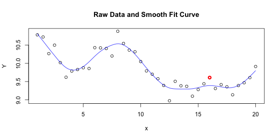
To me, it is very believable that the true relationship between $x$ and $Y$ follows something like this smooth curve and that the data points deviate from it due to random noise. If I had to estimate $g(16)$, I would not hesitate to use the value of our smooth curve over the $Y$ value that I observed at $x=16$. And in this case, I would be right to do so.
plot(x, Y, main = "Raw Data, Smooth Fit Curve, and True Relationship")
points(x[31], Y[31], col = 2, lwd = 3)
lines(grid, fit, col = 4)
lines(grid, sapply(grid, g), col = 3)
legend(x = 11, y = 10.8, c("Smooth Spline Fit of Data", "True Relationship g"),
       lty = 1, col = c(4, 3))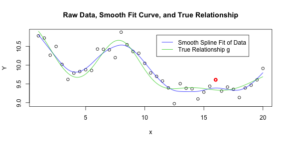
Let’s compare the performance of our raw $Y$ values with the performance of the smooth fit curve in estimating $g$. Assume we were trying to estimate $g$ at all of the $x$-values where we have taken measurements.
est <- predict(s, x)$y
M <- cbind(truth, Y, est)
head(M)


##        truth      Y    est
##  [1,] 10.904 10.779 10.808
##  [2,] 10.684 10.721 10.609
##  [3,] 10.432 10.265 10.407
##  [4,] 10.178 10.497 10.211
##  [5,]  9.952 10.018 10.024
##  [6,]  9.783  9.619  9.881


# Average squared error using raw Y values
sum((M[, 2] - M[, 1])^2)/length(x)


## [1] 0.0312


# Average squared error using smooth values
sum((M[, 3] - M[, 1])^2)/length(x)


## [1] 0.009334
Using the smooth values as your estimates would cut your average squared error by more than a third, in this case.
You might be curious just how smooth you should make your fit curve. A good way to decide is by trying cross-validation for a range of possible smoothness values and seeing which level of smoothness best predicts the left-out data points. The smooth.spline function does this by default and returns the best result.
Let me caution you not to smooth indiscriminately. As this example showed, smoothing makes a lot of sense in some situations, but you need to think carefully about your data before deciding to smooth it. You don’t want to accidentally erase an important pattern in your data by smoothing over it!
Estimating Derivatives
Another application of smoothing is estimating derivatives of $g$ from the data. I’ve posted an article about this before. Recently, a British physics student contacted me for help estimating second derivatives from his data. I did a little work for him, so I decided I may as well share it on this blog.
x <- read.csv("WT.csv")
dim(x)


## [1] 10653     2


head(x, 10)


##    Wavelength Transmittance
## 1         450         46.12
## 2         450         74.50
## 3         450         80.31
## 4         451         46.46
## 5         451         72.64
## 6         451         80.69
## 7         452         56.02
## 8         452         80.18
## 9         452         87.27
## 10        453         64.52


xp <- expression("Wavelength (cm"^-1 * ")")
plot(x, xlab = xp, ylab = "Transmittance", main = "Raw Data")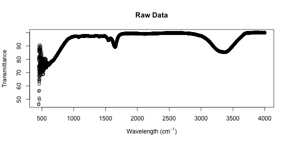
The low wavelength points look pretty wild; let’s zoom in on them.
# Set a threshold to delimit the lower region
t <- 660
small <- x$Wave < t
plot(x[small, ], xlab = xp, ylab = "Transmittance",
     main = "Raw Data (Low-Wavelength Region)")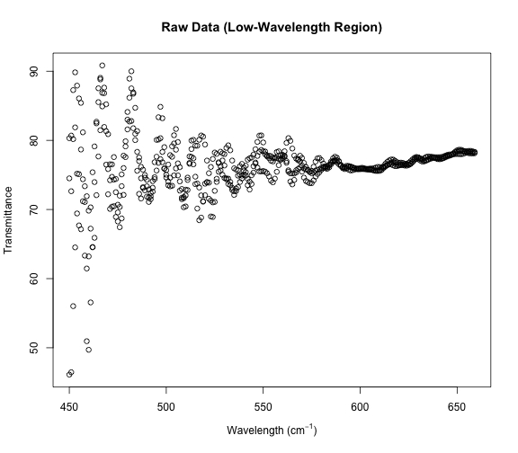
It looks sort of like three separate strands of data, and indeed our dataset has three Transmittance values for each Wavelength.
table(table(x$Wave))


##
##    3
## 3551


# Let's try to separate these strands.
g <- 1:3
plot(x[small, ], xlab = xp, ylab = "Transmittance", col = g + 1,
     main = "Untangling the Strands (Low-Wavelength Region)")
for (i in 1:3) {
    lines(x[small & g == i, ], col = i + 1)
}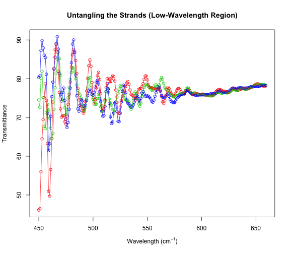
Beautiful! Clearly we have three separate data series that have been merged. And the differences between the series at low wavelengths are much larger than the differences at the higher wavelengths. Let’s estimate derivatives separately for each of these series. Then, we will combine those derivative estimates at the end.
par(mfrow = c(3, 1))
ss <- list()
for (i in 1:3) {
    plot(x[g == i, ], xlab = xp, ylab = "Transmittance",
         main = paste("Data and Smooth Fit for Series", i))
    ss[[i]] <- smooth.spline(x[g == i, ])
    lines(predict(ss[[i]], x$Wave[g == i]), col = i + 1)
}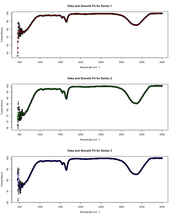
Notice that these smooth curves don’t follow the data very well at small wavelengths. Let’s make a separate smooth fit for that region.
par(mfrow = c(3, 1))
ss.small <- list()
grid <- seq(min(x$Wave), t - 1, length.out = 1000)
for (i in 1:3) {
    plot(x[small & g == i, ], xlab = xp, ylab = "Transmittance",
         main = paste("Data and Smooth Fit for Series", i, "(Low-Wavelength Region)"))
    ss.small[[i]] <- smooth.spline(x[small & g == i, ])
    lines(predict(ss.small[[i]], grid), col = i + 1)
}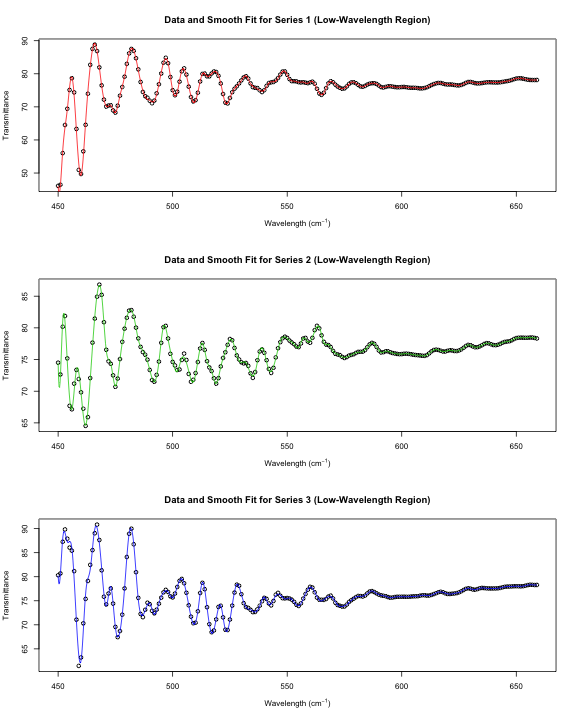
Putting these two smooth fits together, we can compute second derivative estimates for the full wavelength range for each series of data.
d2s <- matrix(NA, nrow = nrow(x)/3, ncol = 3)
colnames(d2s) <- g
w <- x$Wave[g == 1]
rownames(d2s) <- w
large <- x$Wave >= t
for (i in 1:3) {
    d2small <- predict(ss.small[[i]], x[small & g == i, ]$Wave, deriv = 2)$y
    d2large <- predict(ss[[i]], x[large & g == i, ]$Wave, deriv = 2)$y
    d2s[, i] <- c(d2small, d2large)
}
head(d2s)


##          1       2       3
## 450 27.286  35.613  23.980
## 451 10.140  10.742   6.953
## 452 -7.007 -14.129 -10.074
## 453 -1.740  -6.281  -3.088
## 454  3.526   1.567   3.898
## 455 -3.728   3.819  -1.380
# Further investigation shows that the estimates in this first row are
# many times larger than any of the other estimates. It is well known
# that smoothing techniques often estimate endpoints poorly.
# I will estimate this row by its neighbor.
d2s[1, ] <- d2s[2, ]Let’s plot the second derivative estimates for each data series.
plot(c(min(w), max(w)), c(min(d2s), max(d2s)), type = "n", xlab = xp,
     ylab = "Second Derivative of Transmittance", main = "Three Sets of Estimates")
abline(h = 0, col = "gray")
for (i in 1:3) {
    lines(w, d2s[, i], col = i + 1)
}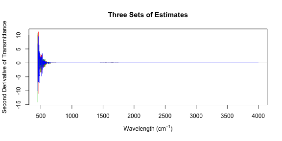
Those plots aren’t very revealing because the low-wavelength second derivatives are so much greater than the second derivatives in the high-wavelength region. Let’s try that again, this time splitting into two regions. I’ll use smooth.spline to compute an overall estimate of the second derivative and add it to these plots.
par(mfrow = c(2, 1))
left <- w < t
plot(c(min(w), t - 1), c(min(d2s[left, ]), max(d2s[left, ])), type = "n", xlab = xp,
     ylab = "Second Derivative of Transmittance",
     main = "Three Sets of Estimates and Overall Estimate (Low-Wavelength Region)")
abline(h = 0, col = "gray")
for (i in 1:3) {
    lines(w[left], d2s[left, i], col = i + 1)
}
# Use a margin of overlapping points for the smooth spline fit
# (extend beyond region boundaries)
m <- max(which(left))
margin <- 10
s2.left <- smooth.spline(rep(w[1:(m + margin)], 3),
                         as.vector(d2s[1:(m + margin), ]))
d2.left <- s2.left$y[1:m]
lines(w[left], d2.left, lwd = 3)

right <- w >= t
plot(c(t, max(w)), c(min(d2s[right, ]), max(d2s[right, ])), type = "n", xlab = xp,
     ylab = "Second Derivative of Transmittance",
     main = "Three Sets of Estimates and Overall Estimate (High-Wavelength Region)")
abline(h = 0, col = "gray")
for (i in 1:3) {
    lines(w[right], d2s[right, i], col = i + 1)
}
M <- length(w)
s2.right <- smooth.spline(rep(w[(m + 1 - margin):M], 3),
                          as.vector(d2s[(m + 1 - margin):M, ]))
d2.right <- s2.right$y[(margin + 1):(M - m + margin)]
lines(w[right], d2.right, lwd = 3)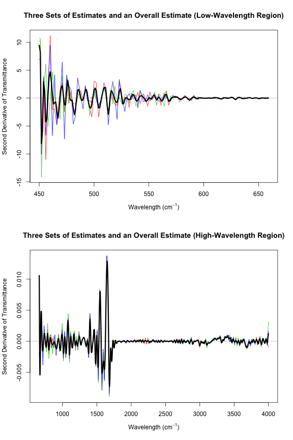
d2 <- c(d2.left, d2.right)Now d2 contains some pretty good second derivative estimates. However, these estimates aren’t quite as refined as they could be. One could improve on this a little by subdividing the original data into more regions. I only used two regions, splitting at a wavelength of $660 \text{ cm}^{-1}$, but clearly the change in variability is quite gradual. Each smooth.spline should be run on a region in which the variability is fairly consistent.
blog comments powered by Disqus