The Null Lineup Math, CS, Data
There’s a useful informal technique for hypothesis testing that I call “the null lineup.” To decide whether or not your data came from some particular null distribution, you generate a handful null datasets, create a plot for each, and place your data’s plot in a lineup with the null plots. If your data stands out strongly from the rest, then you have reason to believe that the null hypothesis is false. Otherwise, you don’t. Keep reading to see a couple of examples.
Looking at Quantile Plots
How do you decide whether or not your data could be normally distributed? Typically students of data analysis are told to create a normal quantile plot. Students are told that the points should be somewhat linear. To me, that instruction is so vague that it is practically worthless. Of course the points won’t be perfectly linear due to randomness. How linear should the points be? Well, that depends on the sample size; you should expect a larger sample size produce a more linear plot. Still, this is not specific enough to be useful to a data analyst. You need to decide if your normal quantile plot would be atypical for a normal sample of that size.
Here’s an informal trick to help you decide. Compare your normal quantile plot to those of a handful of other normal quantile plots for actual normal data that you randomly generate. The code below shows an example of this technique.
NormalQQCompare <- function(x) {
    answer <- sample(1:9, 1)
    n <- length(x)
    par(mfrow = c(3, 3))
    for (i in 1:9) {
        if (i == answer) {
            # QQ-plot for the original data
            qqnorm(x, main = i)
        } else {
            # Otherwise QQ-plot for a true normal
            z <- rnorm(n)
            qqnorm(z, main = i)
        }
    }
    return(answer)
}


# First example: the data was generated from a normal distrubution

x <- rnorm(25)
answer <- NormalQQCompare(x)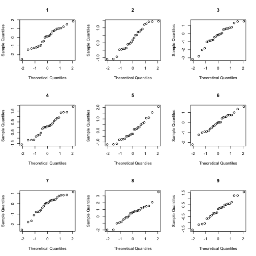
At this point, you do not know which of the plots corresponds to your data. Look at the lineup. Do any of the plots seem to stand out from the rest. Once you have made up your mind about this question, look at the answer variable to see which plot is from your data. If that plot blends in with the rest, then it is plausible that your data came from a normal distribution. To be more precise, we should not reject the null hypothesis that our data is normal. (Technically, this isn’t the same this as asserting that our data is normal, but in practice, we typically do proceed as if the data were normal.)
Of course, in this case our data was generated by rnorm, just like the rest of the lineup, so we should certainly expect it to blend.
answer


## [1] 4
Now, let’s see an example of data that is not generated from a normal distribution.
# Second example: the data was generated from an exponential distribution

x <- rexp(35)
answer <- NormalQQCompare(x)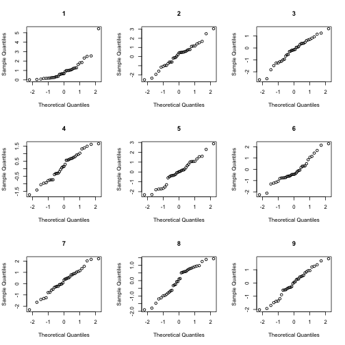
answer


## [1] 1
Pattern or Noise?
I recently had an exchange with a friend who is doing data analysis for a business. Her supervisor told her that a certian price in their industry has a 7 to 12 year period. She was tasked with fitting a model to this cyclic data, and she asked me for a little guidance.
Before proposing a model or estimating parameters, I wanted to make sure that there really is a cyclic pattern to the data. Prices tend to fluctuate in a manner similar to Geometric Brownian Motion (GBM). I used GBM (with a little Gaussian noise added) as a null “patternless” control to compare my friend’s data with.
# Functions to generate Geometric Brownian Motion

BMrecur <- function(x, y, sigma) {
    m <- length(x)
    mid <- (m + 1)/2
    delta <- x[m] - x[1]
    y[mid] <- (y[1] + y[m])/2 + rnorm(1, sd = sigma * sqrt(delta)/2)
    if (m <= 3) {
        return(y[mid])
    } else {
        return(c(BMrecur(x[1:mid], y[1:mid], sigma), y[mid], BMrecur(x[mid:m],
            y[mid:m], sigma)))
    }
}

GenerateBM <- function(end = 1, initial = 0, mu = 0, sigma = 1, log2n = 10,
    geometric = F) {
    n <- 2^log2n
    x <- end * (0:n)/n
    final <- initial + mu * end + rnorm(1, sd = sigma * sqrt(end))
    y <- c(initial, rep(NA, n - 1), final)
    y[2:n] <- c(BMrecur(x, y, sigma))
    if (geometric)
        y <- exp(y)
    return(cbind(x, y))
}


# Read in data
X <- read.csv("../periodic.csv")
t <- X$t
n <- nrow(X)

# Create a lineup of nine plots: eight with GBM and one with the data

set.seed(6)
answer <- sample(1:9, 1)

par(mfrow = c(3, 3))

for (i in 1:9) {
    if (i == answer) {
        # This plot will depict the original data
        plot(t, X$y, main = i, ylab = "y")
        s <- smooth.spline(t, X$y, spar = 0.6)
        lines(predict(s, t), col = 2, lwd = 2)
    } else {
        # Otherwise plot geometric brownian motion
        y <- GenerateBM(initial = 4.4, mu = 0, sigma = 0.8, geometric = T, log2n = 8)[-1,
            2]
        y <- y + 7 * rnorm(n)
        plot(t, y, main = i)
        s <- smooth.spline(t, y, spar = 0.6)
        lines(predict(s, t), col = 2, lwd = 2)
    }
}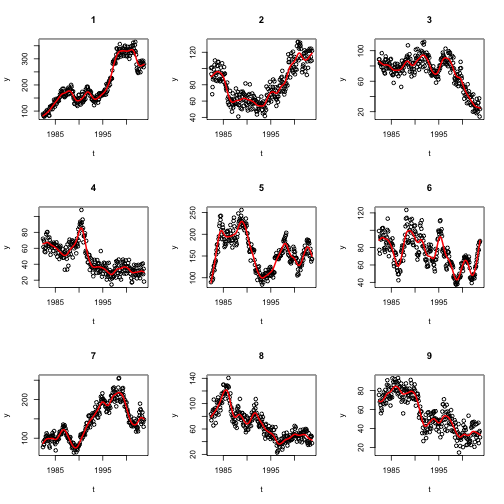
None of these figures stand out to me as much more periodic-looking than the rest. Perhaps there are other theoretical reasons or other evidence that this industry should be periodic, but this particular dataset doesn’t convince me of it.
# Which figure was the data?
set.seed(6)
sample(1:9, 1)


## [1] 6
Final Thoughts
Here’s a problem you might run into when trying to use this technique. What if you’ve already looked at your data before creating the lineup? Well, then you will probably recognize it in the lineup, which will bias your judgment. I suggest showing the lineup to a peer who has not already seen the data and asking for his or her impressions.
It is very easy to see patterns in noise. This null lineup trick is a nice informal way to help you decide whether your “pattern” is real.
blog comments powered by Disqus